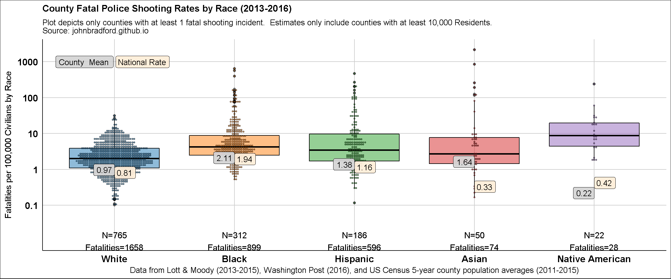
I’ve made the following county-level graphs of fatal police shooting rates by race using data from the Census and compiled from the data I’ve now made available on figshare:
Bradford, John Hamilton (2017): Fatal Police Shootings (2013-2016) & County Level Data. figshare.
Below is the graph. 
I. Loading Data
1. A function to retrieve state abbreviations
getState.abb <- function(x){
  ##remove punctuation and twim white space, convert to lower case
  x <- tolower(trimws(gsub("[[:punct:]]", "", x)))
  x[which(x == "washington dc")] <- "district of columbia"

  states.abb <- c(state.abb, "DC", "DC", "PR")
  states.name <- c(state.name, "District of Columbia", "District of Columbia", "Puerto Rico")

  m.abb <- tolower(states.abb)
  m.name <- tolower(gsub("[[:punct:]]", "", states.name))

    x[which(x %in% m.abb)] <- states.abb[match(x[which(x %in% m.abb)] ,m.abb)]
    x[which(x %in% m.name)] <- states.abb[match(x[which(x %in% m.name)],m.name)]

  return(x)
}
2. Load National Census Population
I could have just summed the county-level race population data to get aggregate, national estimates. But here’s another way to do it, directly. I’ll use these to annotate the graph.
library(readr)
library(dplyr)

census_state <- readr::read_csv("https://www2.census.gov/programs-surveys/popest/datasets/2010-2015/state/asrh/sc-est2015-alldata5.csv")

df_nat <- census_state %>%
  dplyr::filter(SEX == 0) %>% ## selecting only 2015 data, renaming the columns
  dplyr::transmute(State = NAME, Hisp = ORIGIN, Race = RACE, AGE = AGE,
                   population = POPESTIMATE2015) %>%
  dplyr::mutate(State = getState.abb(State),
                Race = replace(Race, which(Race == 1 & Hisp == 1), "White"),
                Race = replace(Race, which(Race == 1 & Hisp == 2), "Hispanic"),
                Race = replace(Race, which(Race == 2 & Hisp == 0), "Black"),
                Race = replace(Race, which(Race == 3 & Hisp == 0), "Native American"),
                Race = replace(Race, which(Race == 4 & Hisp == 0), "Asian"),
                Race = replace(Race, which(Race == 5 & Hisp == 0), "Asian")) %>%
  dplyr::select(-c(Hisp)) %>%
  dplyr::filter(Race %in% c("White", "Hispanic", "Black", "Asian", "Native American")) %>%
  dplyr::group_by(Race) %>% ## Summing across all ages each race within each state
  dplyr::summarise(population = sum(population, na.rm = T))

knitr::kable(df_nat)| Race | population |
|---|---|
| Asian | 22500284 |
| Black | 46282080 |
| Hispanic | 51293572 |
| Native American | 6623941 |
| White | 203787565 |
3. Load County-Level Population and Police Fatality Data
I’m retrieving these from two data files from the figshare dataset. The two files you’ll need are: countyVars.csv and killed_lott_wapo.csv. I’m aggregated the latter and combining with the previous national population estimates by race to get national fatality rates by race.
countyVars <- fst::read.fst(path = choose.files())
dfwl <- dplyr::left_join(countyVars, readr::read_csv(choose.files())) %>% dplyr::filter(pop.c.total_5yr >
    10000)

killed_nat = dfwl %>% dplyr::mutate_at(vars(dplyr::contains("killed")), funs(replace(.,
    is.na(.), 0))) %>% dplyr::summarise(White = sum(killed.white_nh, na.rm = T),
    Black = sum(killed.black, na.rm = T), Hispanic = sum(killed.hisp, na.rm = T),
    Asian = sum(killed.asian, na.rm = T), `Native American` = sum(killed.amerindian,
        na.rm = T)) %>% tidyr::gather(Race, Killed_nat) %>% dplyr::right_join(df_nat) %>%
    dplyr::group_by(Race) %>% dplyr::transmute(Killed_RateN = 1e+05 * Killed_nat/population)

knitr::kable(killed_nat)| Race | Killed_RateN |
|---|---|
| Asian | 0.3288847 |
| Black | 1.9424365 |
| Hispanic | 1.1619390 |
| Native American | 0.4227091 |
| White | 0.8135923 |
4. Get County Frequencies by Race, Join National Rates
dfCount <- dfwl %>%
  dplyr::mutate_at(vars(dplyr::contains("killed")), funs(replace(., is.na(.), 0))) %>%
  dplyr::transmute(
    FIPS = FIPS,
    ##Total = killed ,
    White = killed.white_nh,
    Black = killed.black ,
    Hispanic = killed.hisp,
    Asian = killed.asian,
    `Native American` = killed.amerindian
  ) %>%
  dplyr::group_by(FIPS) %>%
  tidyr::gather(Race, Killed, 2:6) %>%
  dplyr::ungroup() %>%
  dplyr::filter(!is.na(Race)) %>%
  dplyr::right_join(killed_nat, by="Race") %>%
  dplyr::mutate(Race = factor(Race, levels = c( "White", "Black", "Hispanic", "Asian", "Native American"))) %>%
  dplyr::group_by(FIPS, Race)
5. Create the Data!
This is the final step, which generates every variable we’ll use to create the next graph.
df <- dfwl %>%
  dplyr::mutate_at(vars(dplyr::contains("killed")), funs(replace(., is.na(.), 0))) %>%
  dplyr::mutate(
    State = getState.abb(state),
    County = gsub(pattern = "County", replacement ="", x=county),
    County = trimws(County)
  ) %>%
  dplyr::transmute(
    address = paste0(County, ", ", State),
    FIPS = FIPS,
    ##Total = 10e04*killed / pop.c.total_5yr,
    White = 10e04*killed.white_nh / pop.c.white_nh_5yr,
    Black = 10e04*killed.black / pop.c.black_5yr,
    Hispanic = 10e04*killed.hisp / pop.c.hispanic_5yr,
    Asian = 10e04*killed.asian / pop.c.asian_5yr,
    `Native American` = 10e04*killed.amerindian/pop.c.amerindian_5yr
  ) %>%
  dplyr::group_by(FIPS) %>%
  tidyr::gather(Race, KilledR, 3:7) %>%
  dplyr::ungroup() %>%
  dplyr::filter(!is.na(Race)) %>%
  dplyr::mutate(Race = factor(Race, levels = c("White", "Black", "Hispanic", "Asian", "Native American"))) %>%
  dplyr::filter(!is.na(Race)) %>%
  dplyr::group_by(Race) %>%
  dplyr::mutate(KilledR_mean = mean(KilledR, na.rm = T),
                n_zero = length(FIPS[which(KilledR>0)])) %>%
  dplyr::left_join(dfCount, by=c("FIPS", "Race")) %>%
  dplyr::mutate(Killed_Race = sum(Killed))
II. GRAPH
library(ggplot2)
library(ggsci)
library(ggthemes)
#library(ggrepel)


ggplot(data = subset(df, KilledR > 0 & Race != "Total"),
       aes(x = Race, y = KilledR, color = Race, fill = Race,
                      shape = Race)) +
  geom_boxplot(alpha = 0.5, position = "dodge", color = "black") +
  geom_dotplot(alpha = 0.5, position = "dodge",
               color = "black",
               binaxis = "y",
               stackdir = "centerwhole", dotsize = 1, binwidth = 0.05) +
  xlab("Data from Lott & Moody (2013-2015), Washington Post (2016), and US Census 5-year county population averages (2011-2015)") +
  ylab(label = "Fatalities per 100,000 Civilians by Race") +


  ##legend
  geom_label(aes( x = 0.99, y = 1000, label = "County  Mean "),
              size = 3.5,
             fill = "lightgray", alpha = 0.1,
             color = "black",
             hjust = 1) +

  geom_label(aes( x = 1.01, y = 1000, label = "National Rate"),
             size = 3.5,
             fill = "antiquewhite", alpha = 0.1,
             color = "black",
             hjust = 0) +

  geom_label(aes(x = Race, y = KilledR_mean, group = Race,
                 label = paste0(round(KilledR_mean, 2))), size = 3.5,
             fill = "lightgray", alpha = 0.1,
             color = "black",
             hjust = 1,
             position = position_dodge(width = 0.9)) +


  geom_label(aes(x = Race, y = Killed_RateN, group = Race,
                 label = paste0(round(Killed_RateN, 2))), size = 3.5,
             fill = "antiquewhite", alpha = 0.1,
             color = "black",
             hjust=0,
             position = position_dodge(width = 0.9)) +

  ggsci::scale_fill_d3(palette = "category10") +
  ggsci::scale_color_d3(palette = "category10") +
  theme_gdocs() +
  theme(plot.title = element_text(size = 12,face = "bold"),
        plot.subtitle = element_text(size=10),
        legend.position = c(0.12, 0.9),
        legend.text = element_text(size = 12, face = "bold"),
        legend.background = element_rect(fill = alpha("gray", 0.2)),
        axis.title.y = element_text(size = 11, face="plain"),
        axis.title.x = element_text(size = 10, face="plain"),
        axis.text = element_text(size = 12, face="bold")) +
  guides(size = FALSE, stat = FALSE, fill = FALSE, shape = FALSE, color = FALSE) +
  ggtitle(label = "County Fatal Police Shooting Rates by Race (2013-2016)",
          subtitle= "Plot depicts only counties with at least 1 fatal shooting incident.  Estimates only include counties with at least 10,000 Residents.\nSource: johnbradford.github.io") +
  scale_y_log10(breaks = c(.1, 1, 10, 100, 1000),
                labels=c("0.1", "1","10", "100", "1000")) +
  geom_text( aes(y=.01, group=Race, x=Race,
                 label=paste0("N=", n_zero, "\n", "Fatalities=", Killed_Race)),
             color="black")